
Where this brand sits on the studio's spectrum.
Jore House
- Client
- Jore House
- Year
- 2020
- Audience
- Cultural institution
The content of this project is a placeholder and will be replaced with the real case study.
Origin
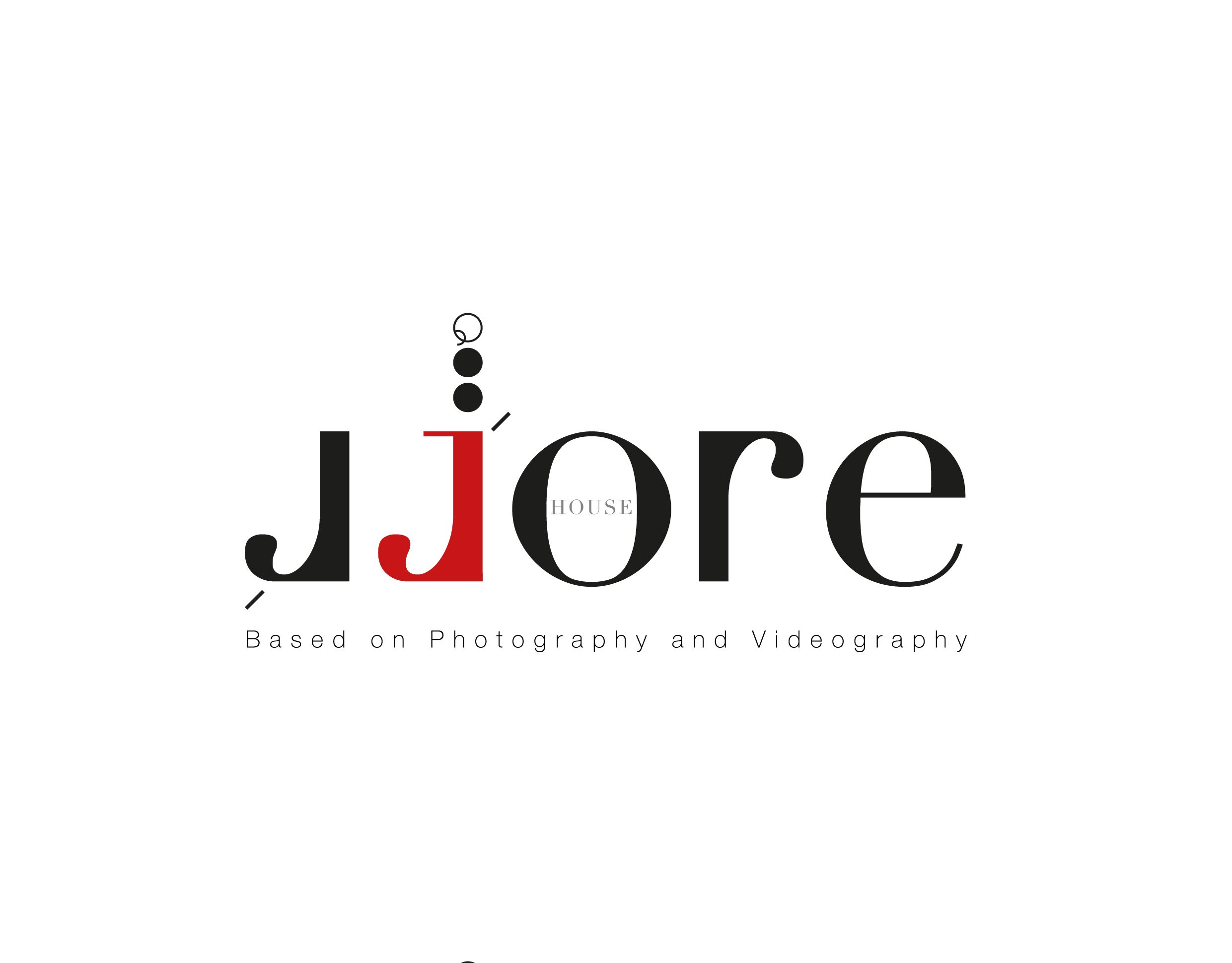
Logo design and brand identity for Jore House, a house for photography and videography.
Meaning
The wordmark doubles the J, one mirrored in black and one set in red.
Experience
Black type, one red accent and lens-like circles point to the camera.
A wordmark that sees its own letter twice.